 前端控
前端控
- HTML中文网
- 联系QQ:88526
- QQ交流群

- 微信公众号


column-break-after
column-break-after:auto | always | avoid | left | right | page | column | avoid-page | avoid-column
默认值:auto
适用于:块级元素
继承性:无
动画性:否
计算值:指定值
always:总是在元素之后断行并产生新列
avoid:避免在元素之后断行并产生新列
设置或检索对象之后是否断行。
对应的脚本特性为columnBreakAfter。
兼容性:
浅绿 = 支持
红色 = 不支持
粉色 = 部分支持
| Values | IE | Firefox | Chrome | Safari | Opera | iOS Safari | Android Browser | Android Chrome |
|---|---|---|---|---|---|---|---|---|
| Basic Support | 6.0-9.0 | 2.0-40.0 | 4.0- 45.0-webkit- | 6.0- 8.0webkit- | 15.0- 29.0webkit- | 6.0- 8.3webkit- | 2.1- 4.4.4webkit- | 18.0- 42.0-webkit- |
| 10.0+ |
<!DOCTYPE html>
<html lang="zh-cmn-Hans">
<head>
<meta charset="utf-8" />
<style>
body{font:14px/1.5 georgia,serif,sans-serif;}
.test p,.test div{margin:0;padding:5px 10px;background:#eee;}
h1{margin:10px 0;font-size:16px;}
.test{
width:600px;
border:10px solid #000;
-moz-column-count:4;
-moz-column-gap:20px;
-moz-column-rule:3px solid #090;
-webkit-column-count:4;
-webkit-column-gap:20px;
-webkit-column-rule:3px solid #090;
column-count:4;
column-gap:20px;
column-rule:3px solid #090;
}
.test div{
-moz-column-break-after:always;
-webkit-column-break-after:always;
column-break-after:always;
}
</style>
</head>
<body>
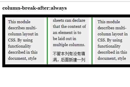
<h1>column-break-after:always</h1>
<div class="test">
<p>This module describes multi-column layout in CSS. By using functionality described in this document, style sheets can declare that the content of an element is to be laid out in multiple columns.</p>
<div>不管本列有没有填满,后面新建一列</div>
<p>This module describes multi-column layout in CSS. By using functionality described in this document, style sheets can declare that the content of an element is to be laid out in multiple columns.</p>
</div>
</body>
</html>点击 "运行实例" 按钮查看在线实例
效果图:
推荐手册