
- HTML中文网
- 联系QQ:88526
- QQ交流群

- 微信公众号


 前端控
更新时间:2019-03-23 10:23:31
前端控
更新时间:2019-03-23 10:23:31
orientation
orientation:portrait | landscape
接受min/max前缀:是
portrait:指定输出设备中的页面可见区域高度大于或等于宽度
landscape:除portrait值情况外,都是landscape
定义输出设备中的页面可见区域高度是否大于或等于宽度。
本特性不接受min和max前缀。
简单列举几个应用示例:
@media screen and (orientation:portrait){ … }
@import url(example.css) screen and (orientation:landscape);
兼容性:
浅绿 = 支持
红色 = 不支持
粉色 = 部分支持
| Values | IE | Firefox | Chrome | Safari | Opera | iOS Safari | Android Browser | Android Chrome |
|---|---|---|---|---|---|---|---|---|
| Basic Support | 6.0-8.0 | 2.0-3.0 | 4.0-25.0#1 | 6.0#1 | 15.0+ | 6.0-6.1#1 | 2.1-4.3#1 | 18.0-24.0#1 |
| 9.0-11.0#1 | 3.5+ | 26.0+ | 6.1+ | 7.0+ | 4.4+ | 25.0+ |
注:#1表示不支持嵌套媒体查询
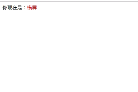
<!DOCTYPE html>
<html lang="zh-cmn-Hans">
<head>
<meta charset="utf-8" />
<style>
.test::after {
  color: red;
}
@media screen and (orientation: portrait){
  .test::after {
    content: "竖屏";
  }
}
@media screen and (orientation: landscape){
  .test::after {
    content: "横屏";
  }
}
</style>
</head>
<body>
<div class="test">你现在是:</div>
</body>
</html>点击 "运行实例" 按钮查看在线实例
推荐手册